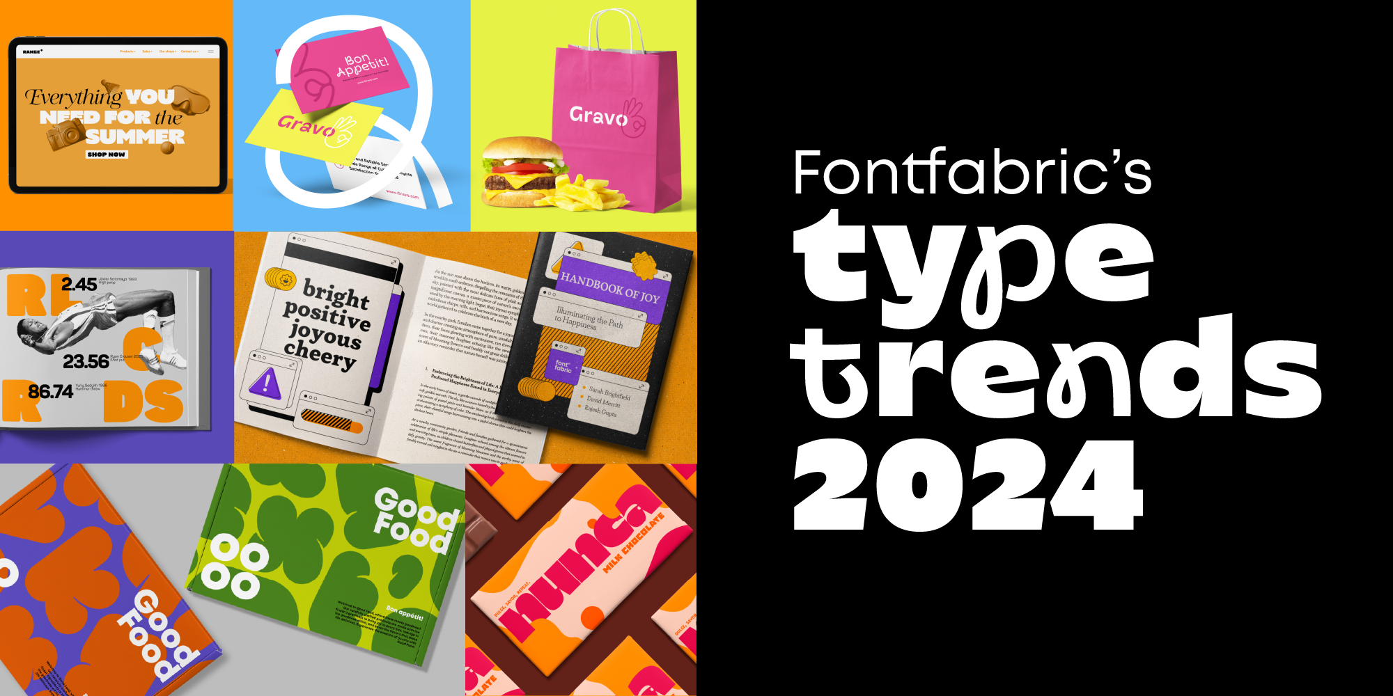
As we step into a new year, the world of graphic design buzzes with the promise of innovation and change. This moment is all about the future of type and typography—the fonts that will soon become essential tools for designers everywhere. In 2024, typography isn’t just about making words legible; it’s about setting the tone, telling a story, and captivating audiences. From the resurgence of classic serifs to the advent of bold, experimental fonts, the trends are as diverse as they are exciting. Let’s dive into the fonts and typography styles that are shaping the landscape of graphic design, guiding us through a year of creativity and transformation
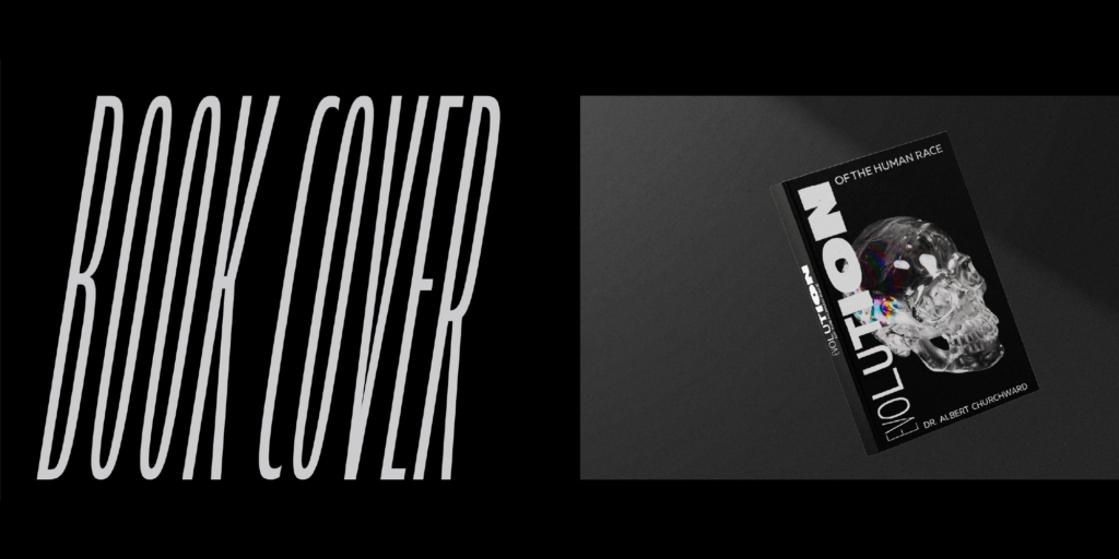
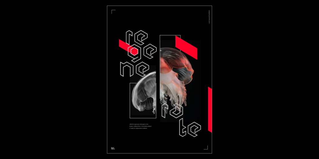
1. Achieving Impact with Strong Character
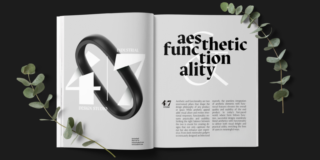
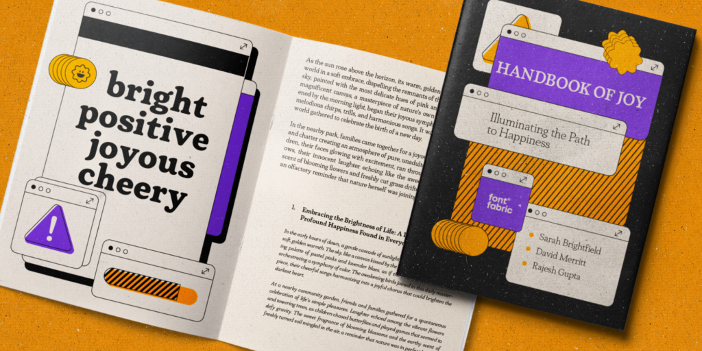
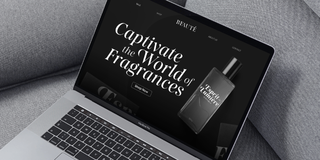
As we navigate the information overload of 2024, the need for typefaces with a strong character and impactful design is undeniable. This movement underlines the necessity for typefaces that not only communicate but also connect on a deeper level, reflecting a growing demand for authenticity and distinctiveness in digital communication.
Amidst this evolving landscape, Auge and Gwen stand as prime examples of how contemporary typefaces can embody this trend, combining uniqueness with the ability to leave a lasting impression. This year, embracing fonts with character isn’t just a design choice—it’s a storytelling strategy, ensuring messages resonate more profoundly with audiences.
2. The Neo-Retro Revolution in Type
The charm of the past meets the innovation of tomorrow in 2024’s “Neo-Retro” typography trend. This movement blends classic forms and vintage styles with a fresh, modern twist, creating designs that resonate with today’s aesthetic preferences. It’s a nod to the past while looking forward, where retro elements are reimagined for contemporary appeal.
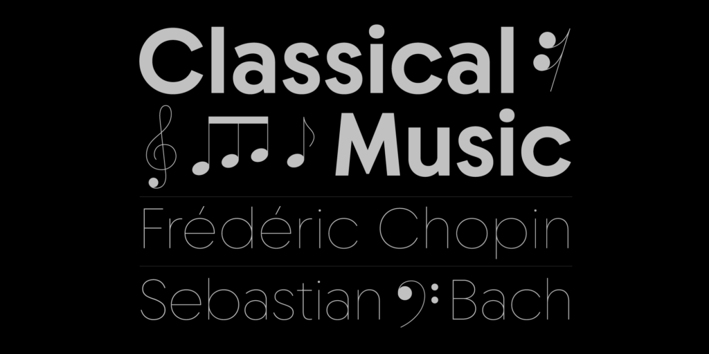
Plush and Chopin exemplify this fusion, drawing direct inspiration from the ’60s while aligning perfectly with modern needs, symbolizing a seamless blend of eras.
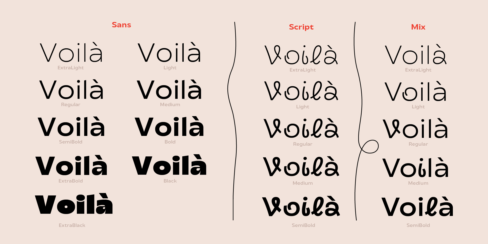
3. Fluid Forms: Variable Fonts Redefine Typography
Exploring the dynamic structures of variable fonts, this trend takes the concept of strong character a step further, embodying transformation and movement. It’s about fonts that adapt and evolve, offering designers unprecedented flexibility to express ideas in flux, seamlessly marrying form with function in a dance of typographic innovation.
Calleo emerges as a pioneer of change, blurring the lines between the familiar and the extraordinary. Calleo Sans sets a standard for versatility, while Calleo Flux invites you into a world of experimental design, where each letter is a playground of possibilities, challenging the conventions of static typography.
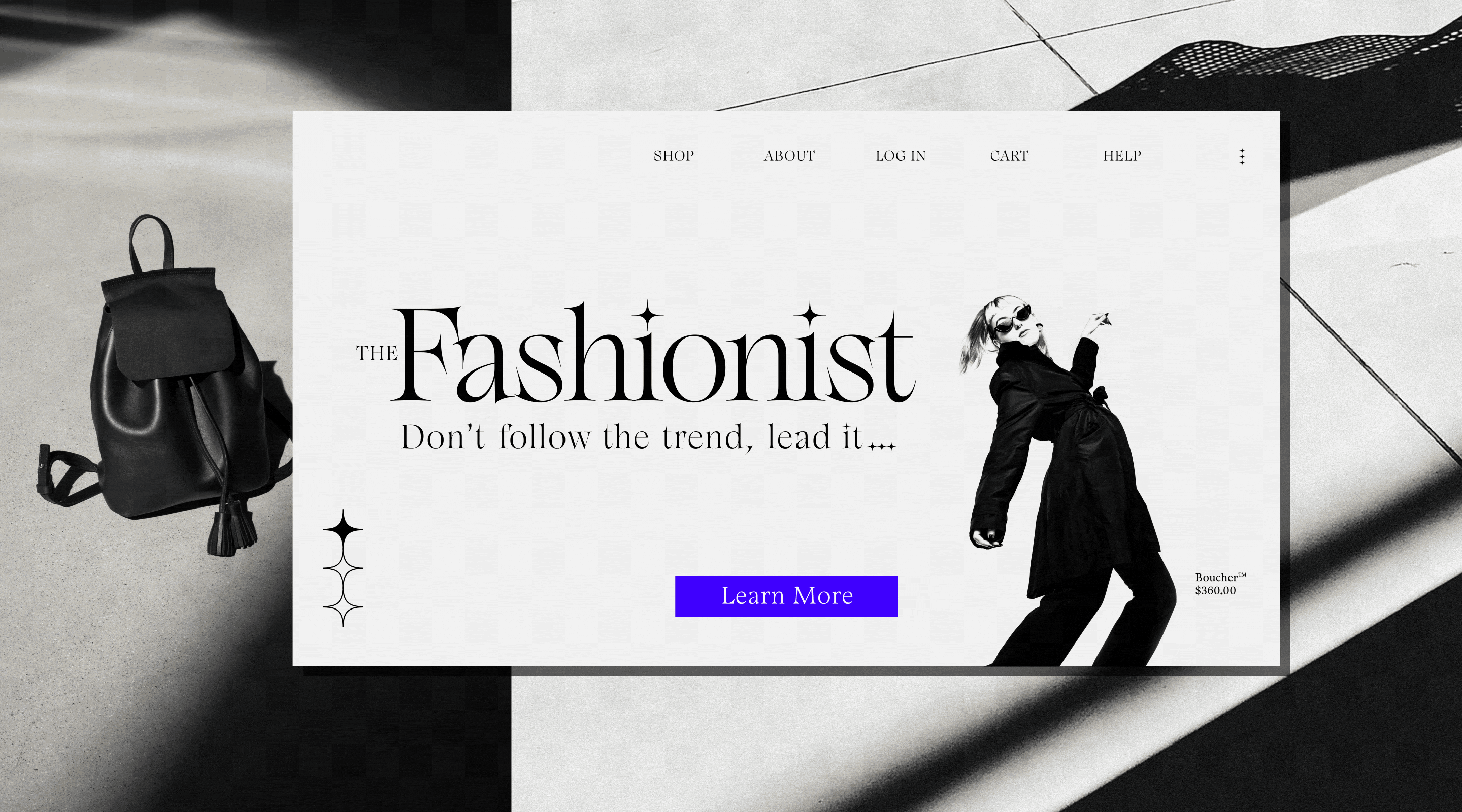
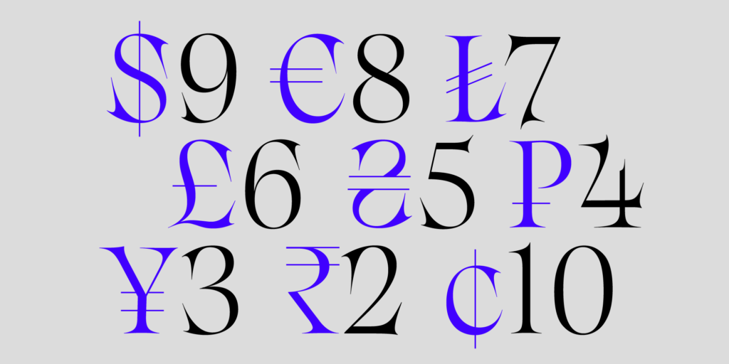
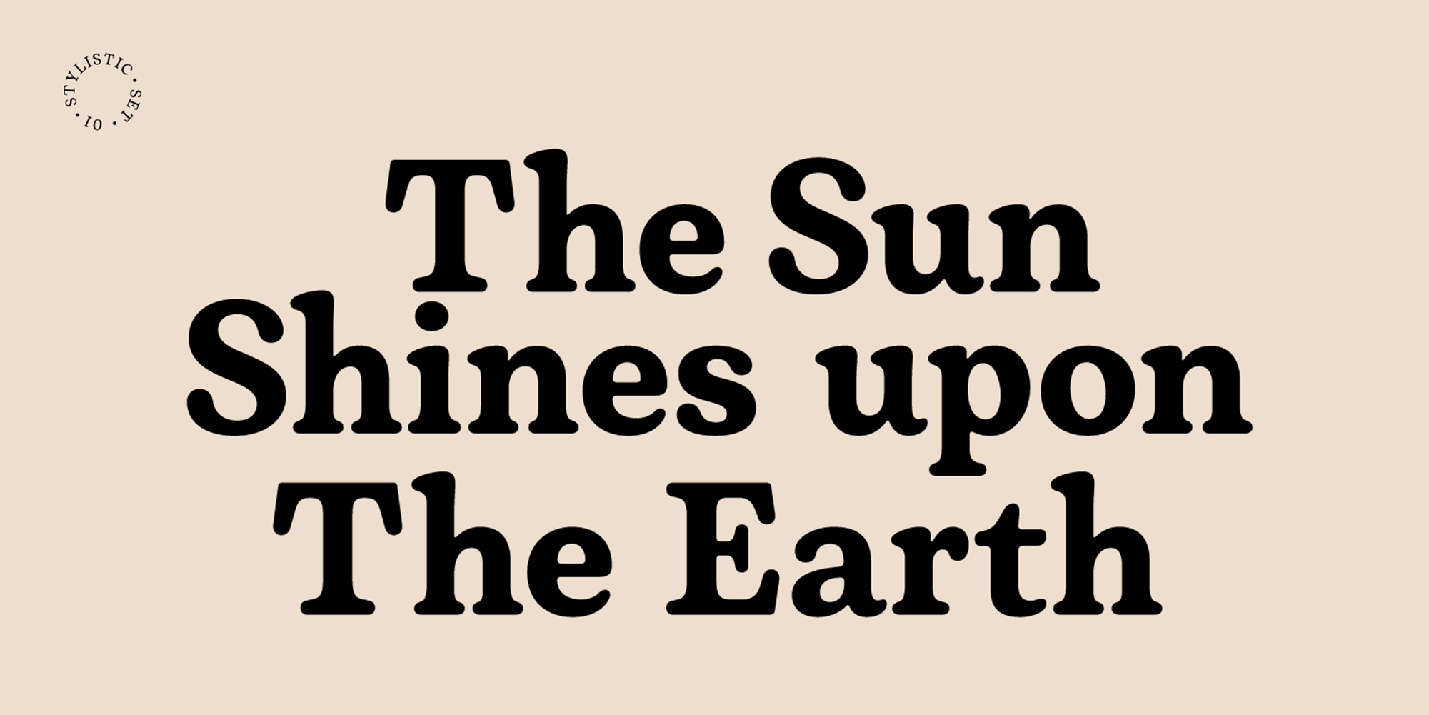
4. Back in Style: The Resurgence of Elegant Serifs
The renaissance of serif fonts marks a return to elegance and authenticity in typography. This trend marries the timeless allure of serifs with modern design principles, offering compositions a blend of sophistication and classical grace.
Through the dynamic interplay of thick and thin strokes, along with refined serifs, this movement not only pays homage to traditional typography but also elevates it, ensuring that each serifed letter makes a memorable impact. With its striking contrast between thick and thin strokes, smooth ovals, and sharp serifs, Salina adds a touch of class to any composition.
Use TRENDS20 for a special discount for all fonts in this blog post.
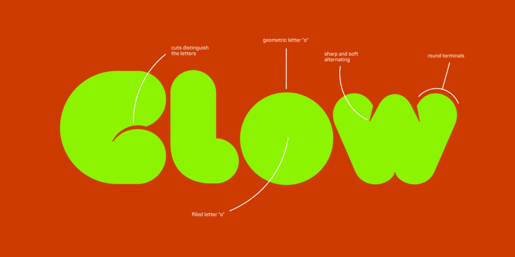
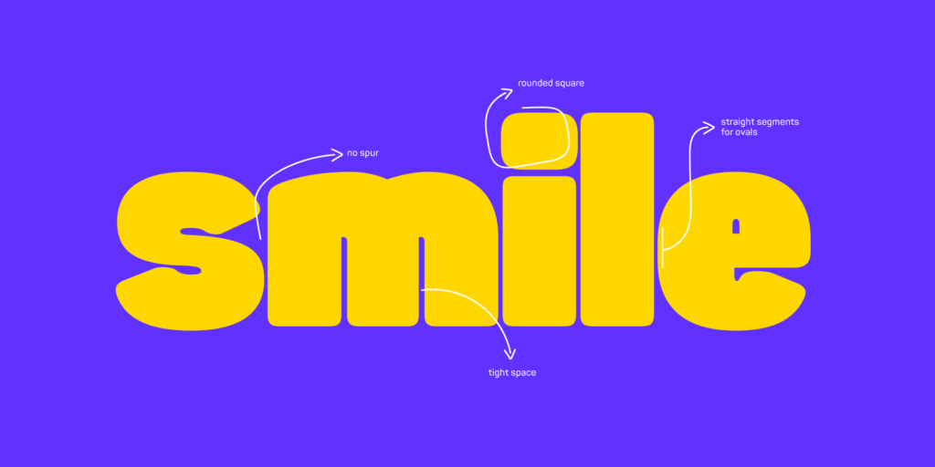
5. Soft Curves, Bold Statements: Embracing Round Typography
The trend of round and soft typography is reshaping design narratives, offering a friendly and approachable aesthetic without sacrificing impact. This movement leans into the allure of curves, providing versatility from bold displays to sleek, minimalist compositions. The emphasis on rounded forms brings a unique warmth and inclusivity to visual communication, making every design inviting and accessible.

In this style, Gismo is the cool kid on the block with its rounded, curvaceous charm. Whether you’re aiming for bold display purposes or a sleek, minimalist look, Gismo has got you covered. With its versatile styles, including Round, Semi-round, Semi-rectangular, and Rectangular, you’ll find the perfect fit for any design project.

Clou Font Family: Applicable for any type of graphic design – web, print, motion graphics, etc., Clou Font Family offers versatility and elegance. Its two styles, Clou Light and Clou Black, are perfect for creating impactful designs, whether you’re working on logos, posters, or other visual elements.
Panton Font Family: With its 54 fonts, including uprights, italics, and bonus icon sets, the Panton Font Family by Fontfabric is a modern and elegant sans-serif typeface. Inspired by classic grotesque typefaces, Panton has its own unique style characterized by softened geometric forms. Whether you’re designing headlines or text blocks, Panton offers excellent legibility and versatility across various design mediums.
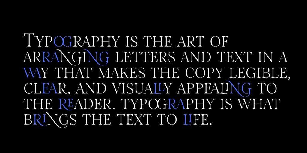
6. The Charm of Unconventionality: Typefaces That Tell More
As typography evolves, so does the appetite for designs that straddle the line between classic appeal and distinctive flair. This trend is about embedding unique, characterful touches into otherwise straightforward fonts. This movement celebrates fonts that incorporate unique twists, breathing life into traditional forms.
We’ve got a brand new typeface in the works, and it’s unlike anything you’ve seen before. Picture a sans-serif font with a quirky twist – one where every letter has the chance to break free and dance across the page. Stay tuned for more updates on this unique creation!
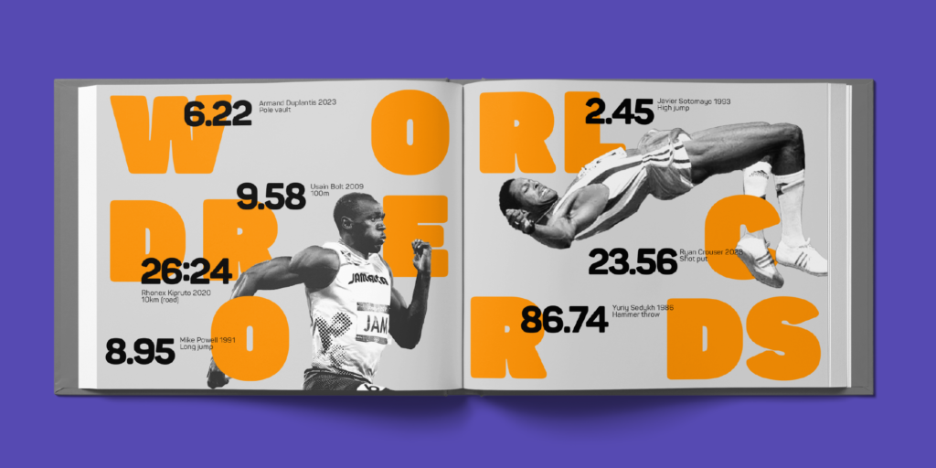
7. Expansive Choices: The Rise of Large Type Families
The trend toward large type families signifies a new era in design flexibility and brand consistency. With an extensive palette of styles and weights, designers now have the tools to fine-tune their messaging across various mediums without sacrificing visual harmony. This approach not only reinforces a brand’s identity but also enriches the design landscape with diverse typographic expressions, making every communication piece a tailored masterpiece.
For big brands and companies, consistency in their visual identity is crucial. Muller Next offers an extensive range of styles and weights that not only allow brands to maintain a consistent look but also provide a wide variety of choices for their sub-brands.
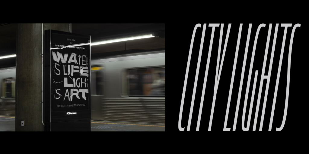
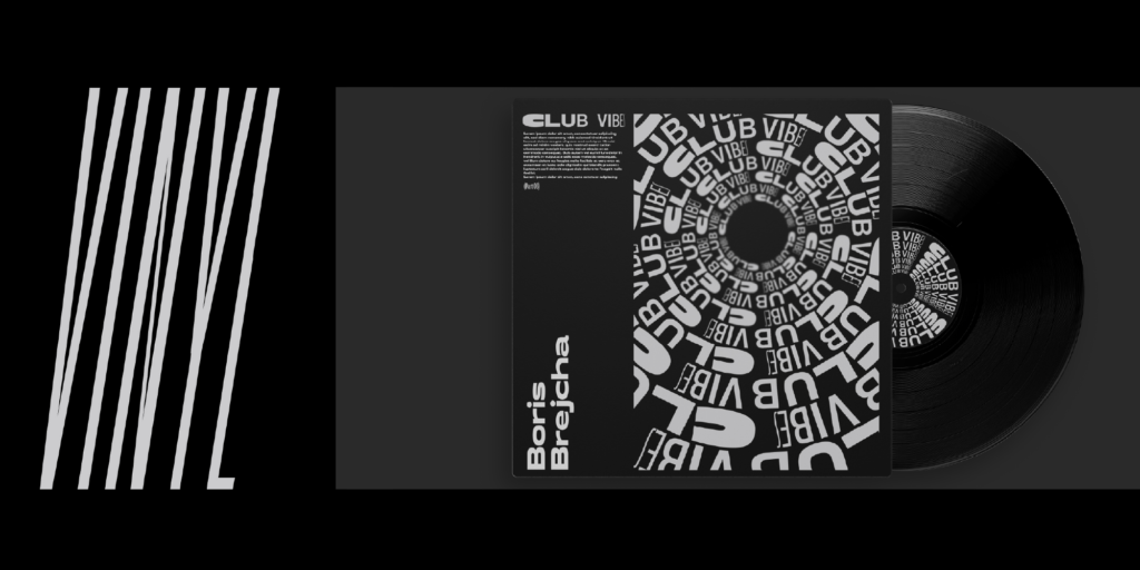
8. Future Forward: The Sci-Fi Aesthetic Redefined
The fascination with the unknown and the futuristic takes shape in the latest typographic trend: sci-fi inspired typefaces. These fonts, with their unique blend of sleekness, bold geometry, and futuristic aesthetics, are setting the stage for design narratives that transport viewers beyond the conventional. Ideal for projects aiming to stand out, these typefaces infuse a sense of adventure and innovation, embodying the spirit of exploration and the endless possibilities of tomorrow.
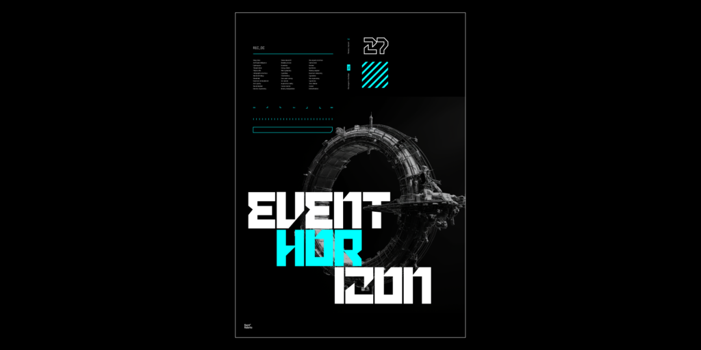

From the sleek lines of Kvant to the bold, geometric vibes of Cubic and the futuristic flair of Facet, these fonts are perfect for projects that demand a touch of futurism.
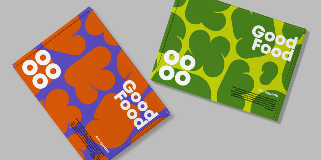
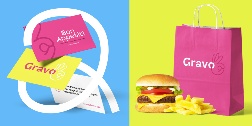
9. Crafting Identity: The Rise of Custom Typefaces in Branding
In the current landscape of global branding, the push for uniqueness propels the movement towards custom typefaces. These tailor-made fonts not only allow brands to embed their identity into every facet of communication but also ensure a seamless brand presence across diverse platforms. In an age where authenticity resonates deeply with consumers, having a distinct typeface becomes a pivotal strategy for brands seeking to forge a genuine connection with their audience.

Beyond the aspect of branding, the economic rationale for investing in custom typefaces becomes clear when considering the high costs associated with font licensing. As the price tag for licensing existing fonts can soar, especially for large corporations, the decision to commission a custom typeface represents not just a creative choice but a financially savvy one. This approach grants companies full ownership over their typographic assets, eliminating recurring licensing fees and fostering a unique brand identity that is both cost-effective and distinctive in the long run.
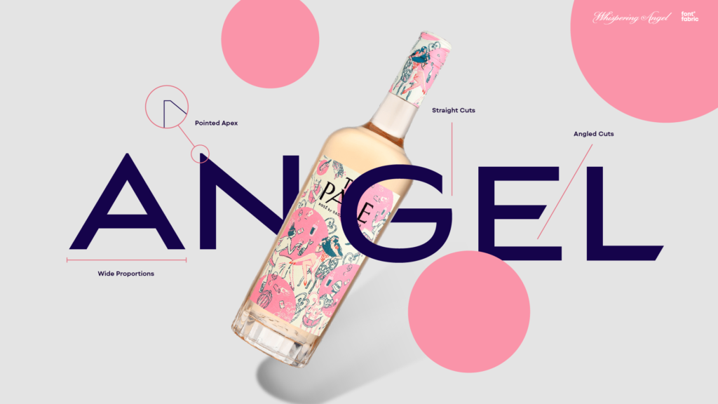
From Kiko Milano to Vega Protocol to Whispering Angel, brands are embracing custom typography to stand out in a crowded market. We helped them. With a custom font, you can truly make your mark and create a one-of-a-kind brand identity.
Contact us for custom typography —>
Wrapping Up 2024’s Typographic Trends
So there you have it, folks – our take into the exciting world of type trends for 2024! Which trend are you most excited about? Let us know in the comments below, and don’t forget to stay tuned for more updates from our type foundry.
Until next time, happy designing!
