


The year is 2014 and the telecommunications sector in Bulgaria seems to be in a rather stagnant place. Three major companies compete over shares in the country and the human factor in advertising efforts appears to be overlooked.
If you were here, you would know.
As a company based in the capital of Bulgaria, our team at Fontfabric witnessed all that change first-hand.
It was one thing to experience the long-awaited power of swift mobile Internet services. On a whole other level we, as part of a forward-thinking generation, felt drawn to the refreshing authentic approach of Telenor (Bulgaria).

“Globul Becomes Telenor”
By the time Telenor officially acquired and renamed the then renowned company Globul, their team already had a strong go-to-market strategy mapped out. A great advantage hid in the well-refined vision of how to make an entrance in the Bulgarian market.
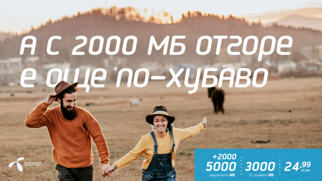
Following Telenor’s traditions, the change started with a large-scale brand image campaign. The company aimed to outline what it stood for: being close to the people.
To find a new way to reach the customers Telenor Bulgaria worked alongside Ogilvy and later on chose DDB to handle the brand’s journey.
Together, they picked a direct and modern way of communication, rising above traditional advertising.
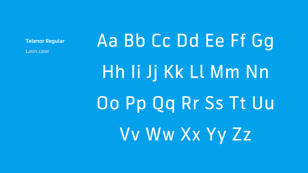
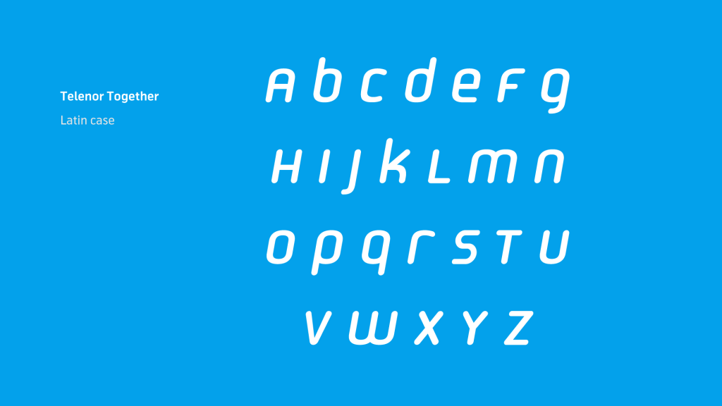
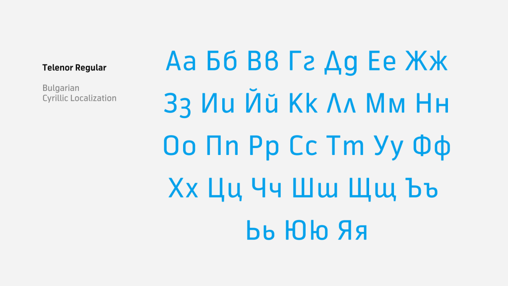
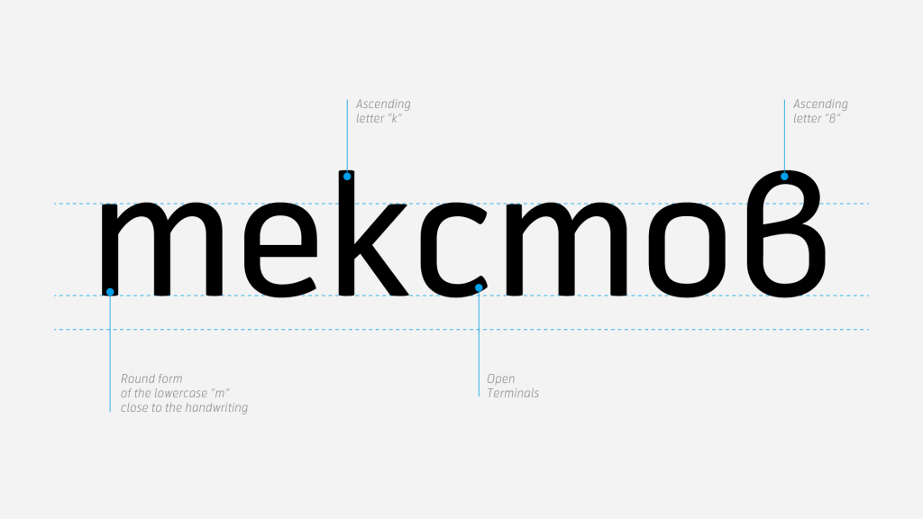
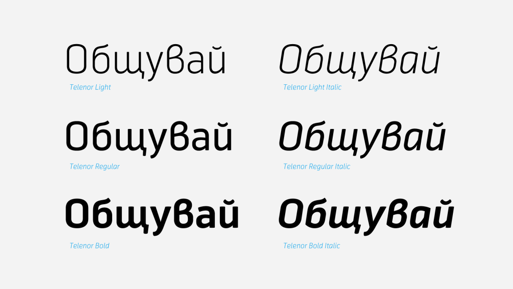
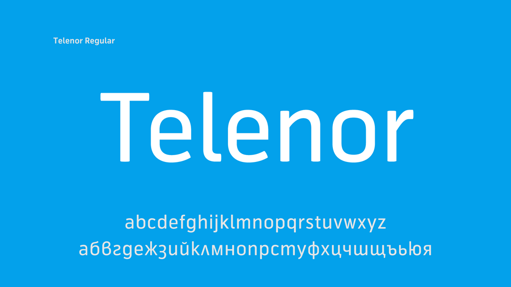
In preparation for the big reveal, we were approached to localize their corporate typeface designed by Magnus Rakeng и Stian Berger, as well as the display font Together by Pijama Consulting. Shortly before the launch campaign “Globul becomes Telenor” DDB requested an additional Cyrillic font for the second campaign wave – entirely custom, based on brush calligraphy.
Cutting Edge Authenticity
Telenor Bulgaria went fully local.
To this day their campaigns use familiar sites from all around the country, real people (not actors), and amiable language that feels as if talking to a friend. All relatable communication elements that proved of great value for the Bulgarian customers and their everyday lives.
The role of the typography is crucial in conveying the spirit Telenor’s team was aiming for. This is a mission that hits us close to home, as we’ve been nurturing the usage of the Bulgarian form of the Cyrillic script since our creation, back in 2008.
Moving Ahead of Time
You might say that time was both Telenor’s pain point and our biggest challenge. The tight deadlines meant breaking a sweat in the dynamic localization process, which took a total of 3 weeks.
We managed to fully kern, test, and finalize the entire type family while working on the display font simultaneously. It’s worth mentioning, this typeface already supported a Russian version of the Cyrillic letters. Nonetheless, the client and their agency chose to go with the Bulgarian version, making this project even more notable.

The display font “Together” stood out as a more intricate task in our design process, as its nature is rather unconventional. It consists of an uncharacteristic set of Latin unicase letters with upper and lower extents.
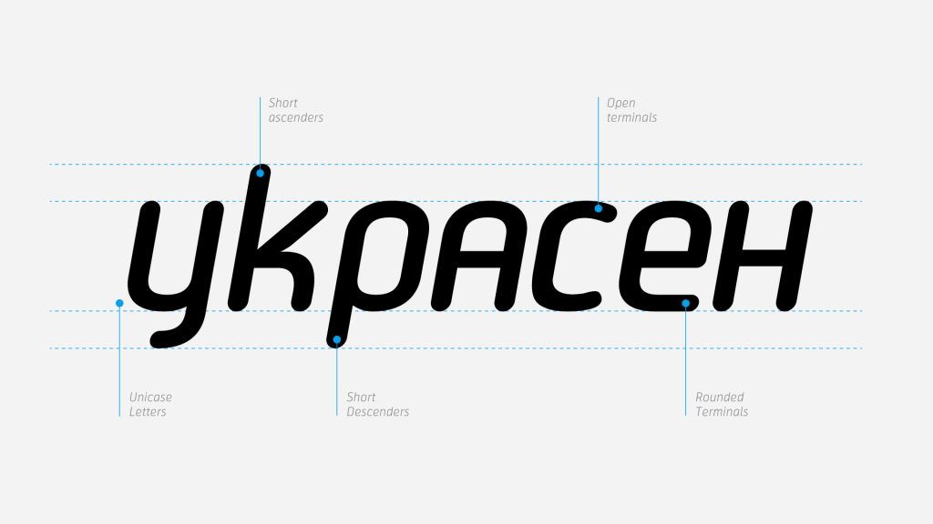
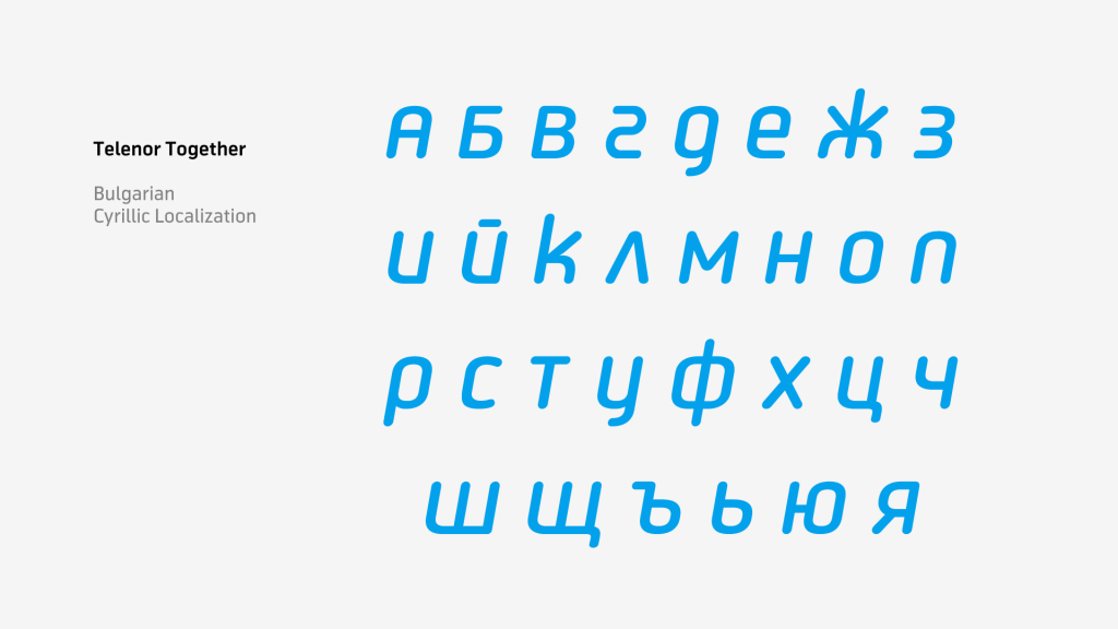
In this particular case, we were to handpick where to use uppercase letters (such as “В”) and lowercase letters (such as “Д”), in order to maintain consistency with the original Latin font.
When the corporate typeface and the display font finally shone on all print materials, web placements, and advertising spots it was, in all honesty, a moment of pride.
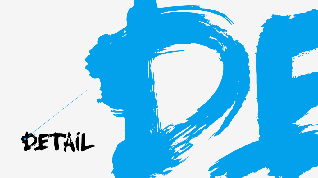
Paint It With a Narrow Brush
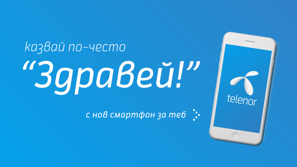
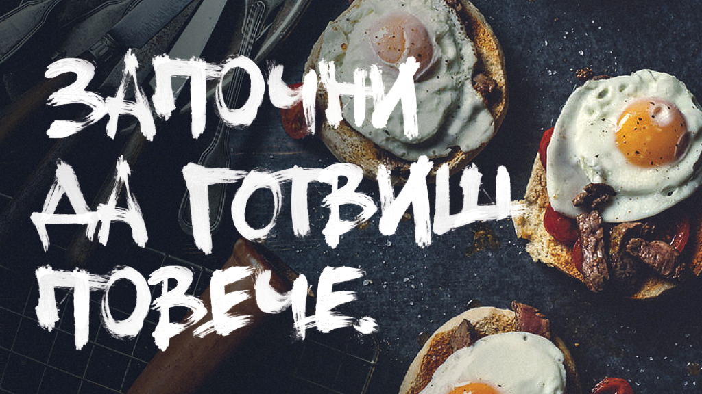
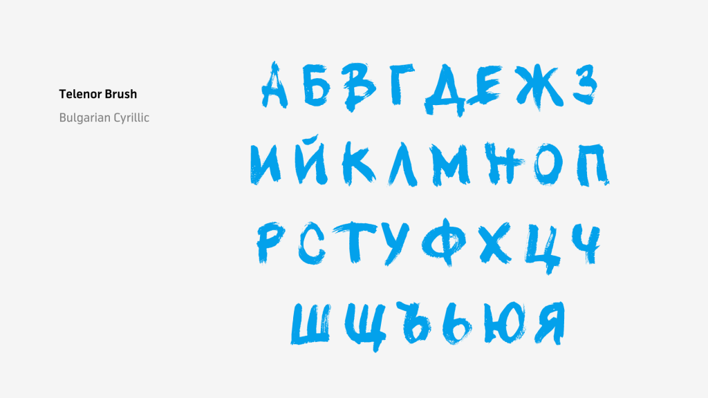
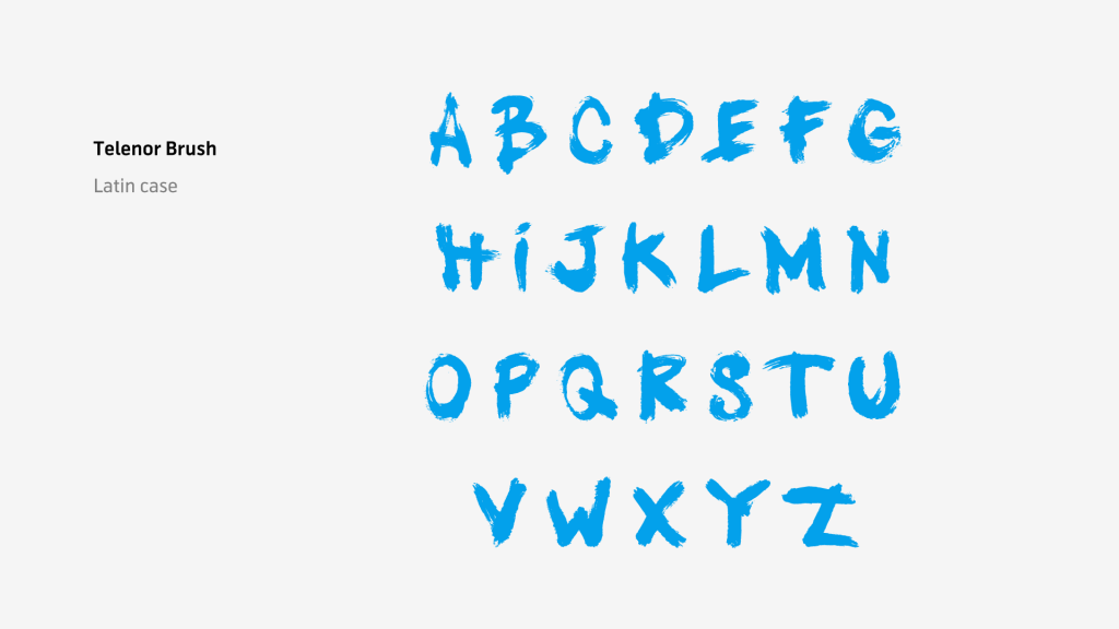
Loaded with buckets of ink we rolled up our sleeves and went back to drawing on paper. Truth is, back in 2014 the fonts market was lacking brush typefaces that support the Cyrillic script.
It was our task to design something entirely new without losing the unique feel of the seemingly never-ending handwritten stroke. And do it successfully in the blink of an eye. Or exactly 2 weeks.
Consequently, every word and sentence turned out to be one-of-a-kind, as we created several variations to each letter in the Bulgarian form of the Cyrillic script, which we then included in the main lowercase, uppercase, and alternative letters.
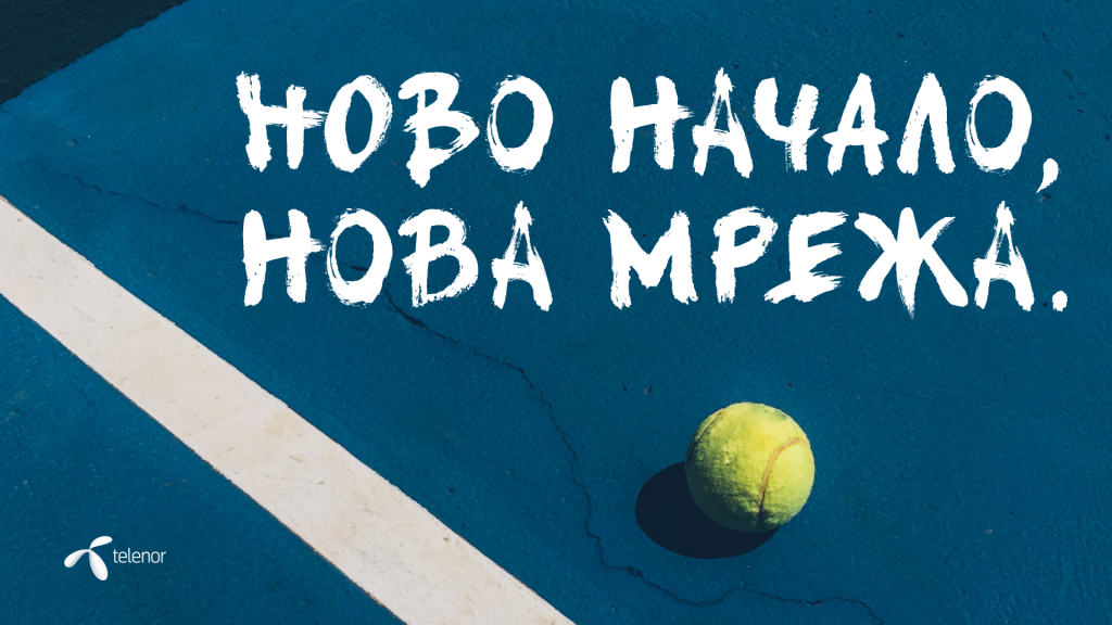
As a purebred campaign font, the brush design was used in all visuals of the client’s first serious advertisement under the name Telenor Bulgaria.
“We’ll never forget the first time we drove by a full-fledged transparent on a side of a building in Sofia. It was grand!”
— Svetoslav Simov, Founder & CEO of Fontfabric Type Foundry
The Beginning Of a New Era
Usually, it takes time to gain a bit more perspective and assess the influence of a bold company. This was not the case with Telenor Bulgaria, as their team managed to set the bar higher from day one of their advertising communications.
It wasn’t until Telenor’s first campaigns, that customers started visualizing the importance of staying connected. It takes a step inward for a company to start speaking the same language and recognize the power of human interaction.
Browse all Fontfabric font case studies.
