


You hear the roaring engines even before you step into the light of one of the grandstands.
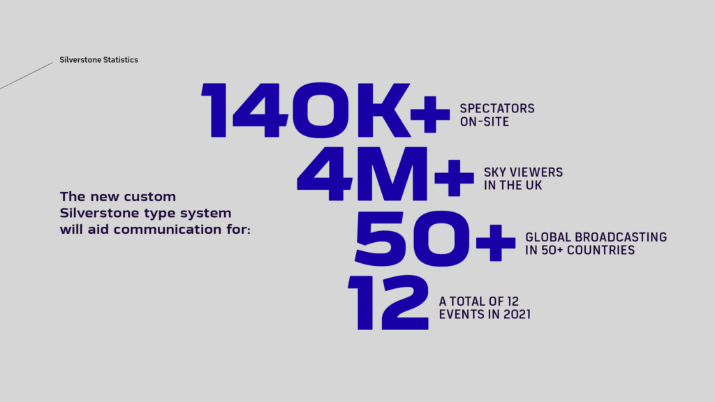
Over 140,000 people are on their feet, witnessing the mastery of motorsports legends whizzing by at 223mph.
You can’t help but share the intoxicating adrenaline of rivalry, talent, triumph, and heartbreak in the biggest event of the year.
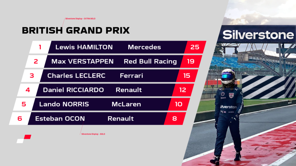
This is the British Grand Prix hosted by the iconic Silverstone Circuit—a crown jewel in British motor racing harboring spectacular victories since 1947.

And it is now, a day before the 2021 British GP, our childhood fascination with fast cars officially grows into an outright Fontfabric font design pride.
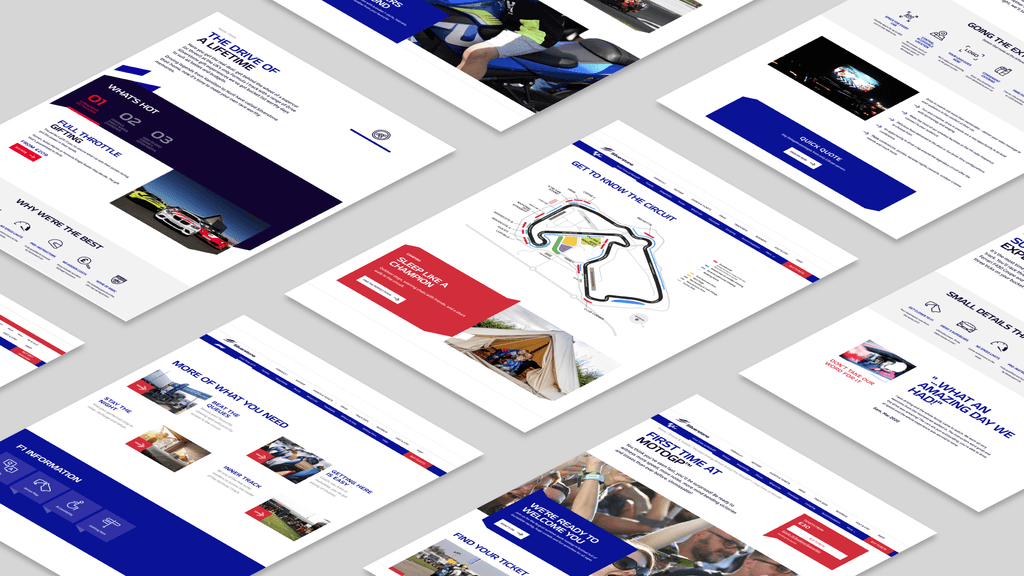
As part of Silverstone’s rebranding, the renowned AgencyTK contacted us in July 2020 to develop a new custom typeface to complement the new identity and aid communication beyond F1 for generations to come.
A Quick Pit Stop
2020 was a turbulent year that might have stopped Silverstone in its tracks but never truly managed to keep the wheels from turning.
All teams quickly adjusted to the disruptions in the established communication, and through effective partnership, we kept a steady pace towards a finished rebrand.
After first seeing the developed visual identity and general direction of the project from AgencyTK, it was our turn, as professional type designers, to translate Silverstone’s goals into a strong typographic language.
The final destination was to create a custom type system that:
- Complements the iconic track and new brand identity
- Carries the traditions of British motorsports
- Meets all usability requirements for on- and offline environments
- Steers away from conventional aggressive typography
- Helps the track outgrow its role as an F1 host
- Completes Silverstone’s image as the company launches new ventures
The Warm-up Lap
Working around a shifting timetable, we decided to outline each phase in the corporate font design process.
Upon our recommendation, the new custom type system includes:
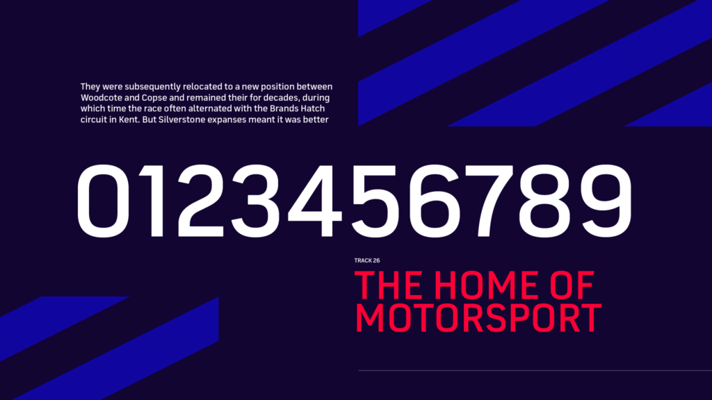
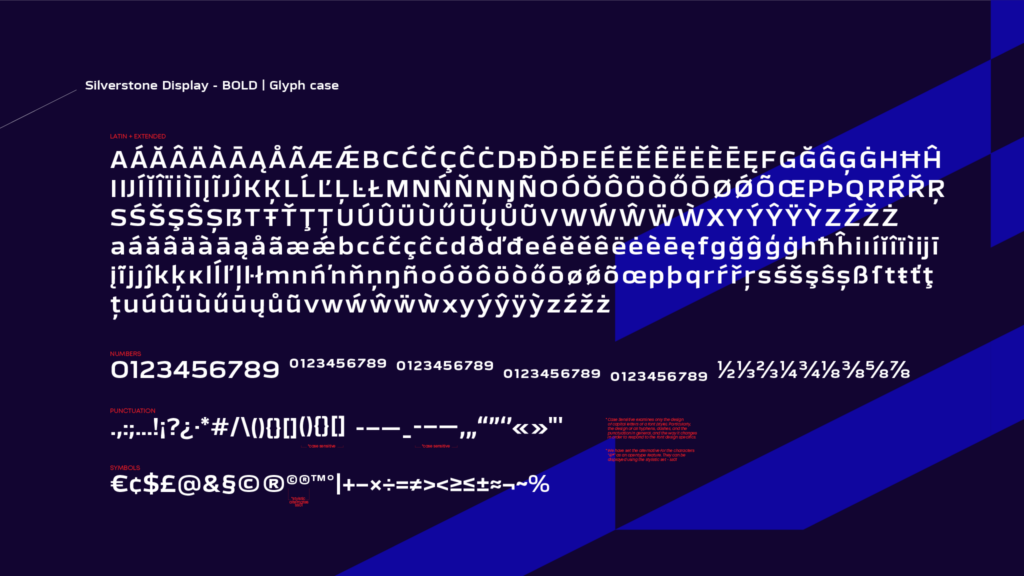
- One leading font with display characteristics in Bold and ExtraBold for headings translating all distinctive qualities of the Silverstone brand and circuit
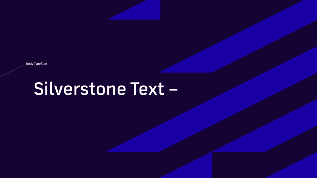
- One Text font family with variety in weights and styles to cover all usability expectations in the rebrand on-site and online
A Bold version of the Text family posing as a Display font would’ve been underwhelming. Hence, we opted for an independent display version with a strong identity and wider proportions. The Text font family, on the other hand, is more condensed for excellent legibility.

Notable Neo-grotesque fonts served as inspiration in the prototyping phase. Additional alterations were made to fit the existing style guidelines and steer the final product in a modern visual direction.
Shifting into Fifth Gear
After a swift concept approval, we set out to design the Silverstone Text family.
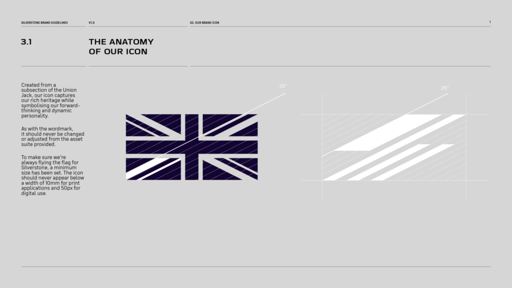
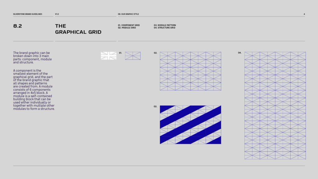
Based on the established grid system and its constructive elements, the design team altered all letterforms following a 26-degree angle from a specific subsection of the Union Jack flag.

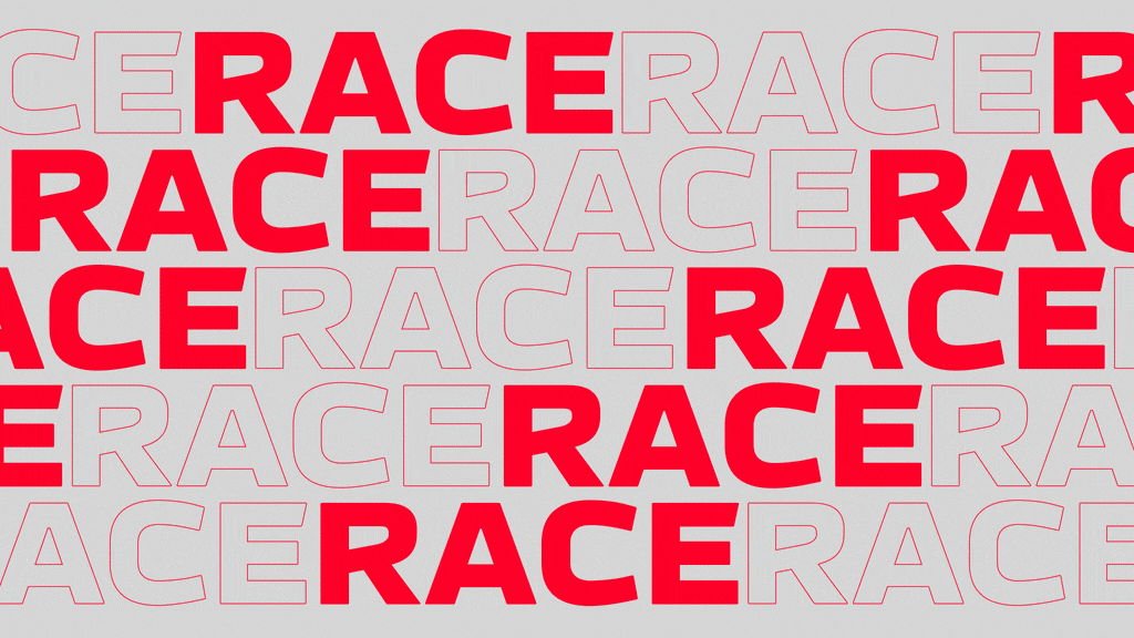
The Text family features sharp-angled terminal cuts with slightly rounded ends, squarish ovals, and acute angles where the ovals meet the stems. It comes with:
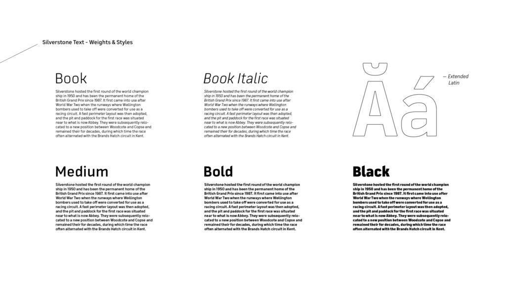
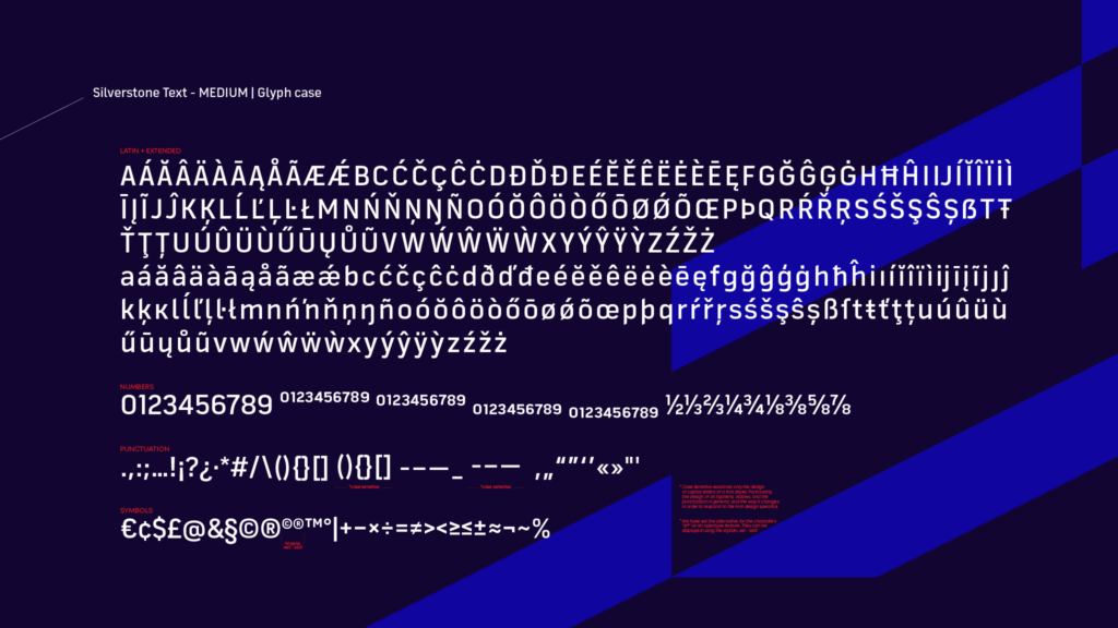
- Four weights—Book, Book Italic, Medium, Bold, and Black
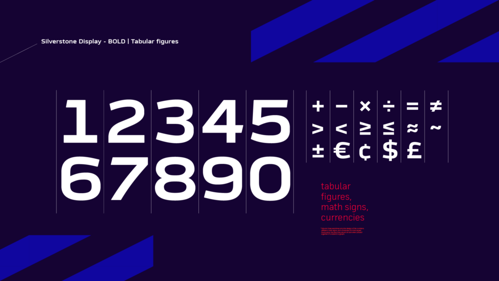
- A glyph case including numbers, tabular figures, math signs, currencies, punctuation
- And extended Latin script for flawless usability
Ventsislav Dzhokov, Type Designer at Fontfabric, shares:
“When I first saw we’ll be designing Silverstone’s new typeface, there was an instant childhood flashback to when my brother and I played with a collection of miniature metal die-cast race cars.
It was a challenge I believe we tackled successfully. I hope the new letterforms become an integral part of the refreshed Silverstone brand for generations to come!”
It took us several iterations to get the green light for the Silverstone Display font. The established constructive principles for the Body type family didn’t work well for headings. We needed a solid idea to reflect the Silverstone brand perfectly.
Plamen Motev, Type Director of Fontfabric, recalls a pivotal moment:
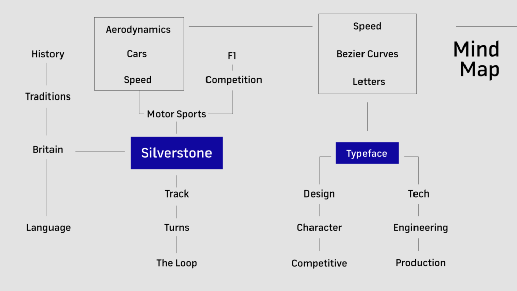
“The solution had to be distinctive and yet moderate. I focused on the track’s history and generated many ideas based on a buildable mind map.
After long hours of research and sketching, the Netflix F1 series was one of the last places I expected to trigger a golden idea. It was during a binge-watching session at 3am I thought to myself: What if I linked the construction of the Bézier curve to the bolide’s aerodynamics?”
After several rapid iterations, we verified all oval elements could indeed follow this principle. The idea got instant approval. We then refined all letterforms by cutting the terminals and rounding the ends slightly to tone down the aggressiveness.
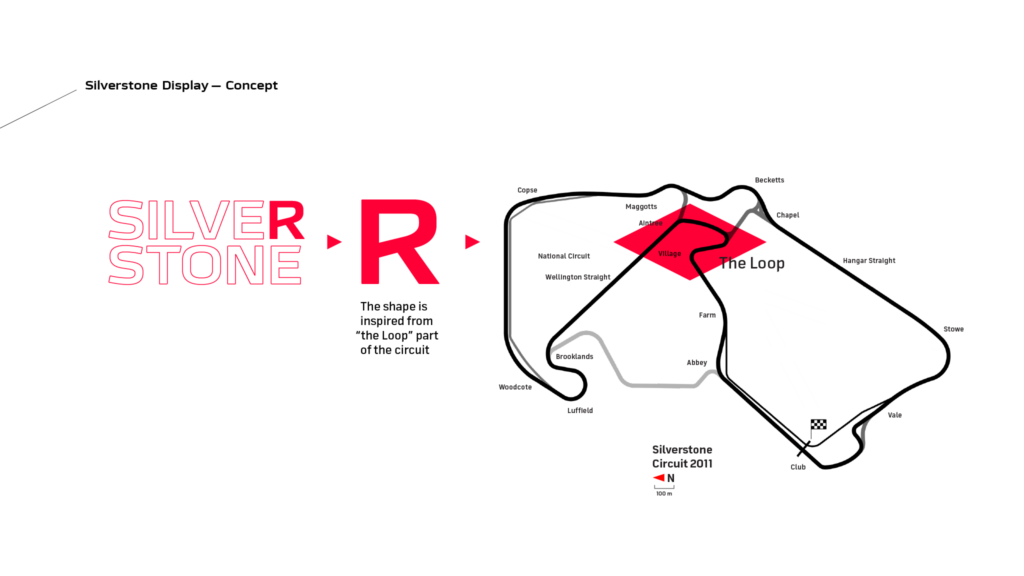
The finishing touch in the Display font is the distinctive capital R which celebrates both the Silverstone brand and the iconic track. It is based on the infamous bend in the circuit—the Loop.

Emma, Account Director, AgencyTK
“With Fontfabric’s help, we delivered a font with a distinctive character while following existing brand guidelines and graphic style. Fontfabric gives you excellent service and a willingness to go above and beyond.”
The Checkered Flag Straight Ahead
After rigorous testing, we delivered the final type system in January 2021. In a way, this marked the exciting beginning of Silverstone’s new visual identity and the brand’s return on the post-pandemic global scene. Only now, ready to venture into new territory beyond the British GP.
Browse all Fontfabric font case studies.
