


Tea is the single most comforting substance one would daydream about when picturing stress-free surroundings.
Humanity has enjoyed the occasional cup of heart-warming tea for almost 5000 years now, and it’s fair to say it has grown to an industry deeply rooted in our cultivation traditions and inner pull to nature’s hidden secrets.
However, this is not a story of the accidental leaf that drifted from an overhanging wild tea tree into a boiling pot of water. It is about a modern spin on innovative brand positioning and the digital tools that proved powerful enough to solidify a company’s uniqueness.

Turning over a new leaf
If you’re the kind of person to know their tea, you’ll understand the amount of excitement we at Fontfabric felt, when we first got contacted by the renowned UK agency DesignBridge at the beginning of 2017.
Their client, none other than Lipton, the fifth most influential tea producer in England, had decided on a packaging update. The font of choice being Intro Script — a famous Fontfabric type family, part of the Intro type system used in Lipton’s packaging many times over.
Even though the name Lipton may ring a bell for most, the company’s story is all too underrated. It began in the 1800s from one man, Sir Thomas Lipton. His innovative approach quickly spread throughout his business, a booming chain of stores across Glasgow.

A few of his creations included: a cable car system for leaf transportation, a multiple weight option for tea packages, and a marketing strategy that advertised Lipton teas as coming directly from the tea gardens.
Today, the Lipton brand, and the Lipton Ice Teas in particular, still cover a hefty portion of the stores’ shelves in more than 110 countries worldwide. Their century-old traditions never ceased to inspire generations of employees.
At the point of our contact, Lipton Ice Teas were on the verge of a visual identity completion, aiming for a subtle, yet memorable representation of their close connection to all-natural products.
The element that started it all
DesignBridge approached us for a custom typography project which was later on implemented in the Lipton Ice Teas packaging.
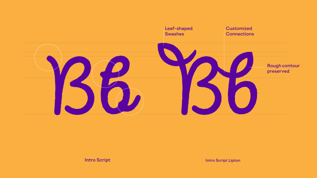
The brief was focused on the element of the leaf which was to be incorporated into the constructions of all letters from the English alphabet. Naturally, the soon-to-be-modified typeface Intro Script originated from the Intro series — the brand font of the company.

The apparent challenge was to develop a design concept which corresponded with the letters’ characteristics. That way we would ensure that all additional leaf elements feel consistent, rather than foreign when weaved into the font.
Consequently, the Intro Script modification was designed with the sole purpose of becoming a suitable addition to the Lipton Ice Teas product line.
Looped in
Following the rhythm of a fast-paced project, we concentrated our efforts on functionality and aesthetics. After reaching a mutual conclusion that the “loops” in the script are a fitting solution for representing leaves, we went ahead and proposed two main variations to the client.
The first one visualized a more round leaf with softer curves. The other concept used a more refined, edgy leaf that bore a close resemblance to a real live one. All teams came to a swift decision and chose to continue the design process with the more structured variation of the leaf.
Designed to stand the test of time
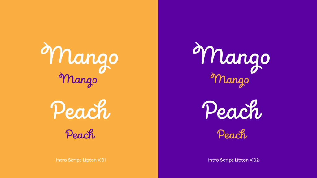
Taking roughly a week, our type design process focused on keeping Intro Script’s key characteristics, all the while developing a more specific font to meet the client’s vision.
It came as no surprise that the font’s iconic playfulness and handwritten features synchronized perfectly with the floral loops.
By the end of the fourth week, we had gone through one round of amendments where we presented our ideas of implementing the modifications, and the accelerated completion of the font design itself. The client felt happy with the end product and we proceeded to the final delivery of the newly customized Intro Script.
“How cold became the new hot”
Working on the custom project for Lipton Ice Teas stands as a prime example of the synergy between a client, a design agency, and a typе design studio. From beginning to end, we were able to successfully relate to Lipton’s mission and long-standing traditions.
It is fair to say that memorable type design originates from both a solid concept and a heartfelt idea. The customized Intro Script which since then decorates the Lipton Ice Teas product line represents just that.
Browse all Fontfabric font case studies.
