


Visual Communication Revisited
The end of 2017 was marked by a challenging project after Polish pharmaceutical leader Polpharma approached us at Fontfabric as part of their go-to-market strategy. With over 85 years of rapid development and around 7500 employees worldwide, Polpharma Group was on the verge of yet another accomplishment on an international level.
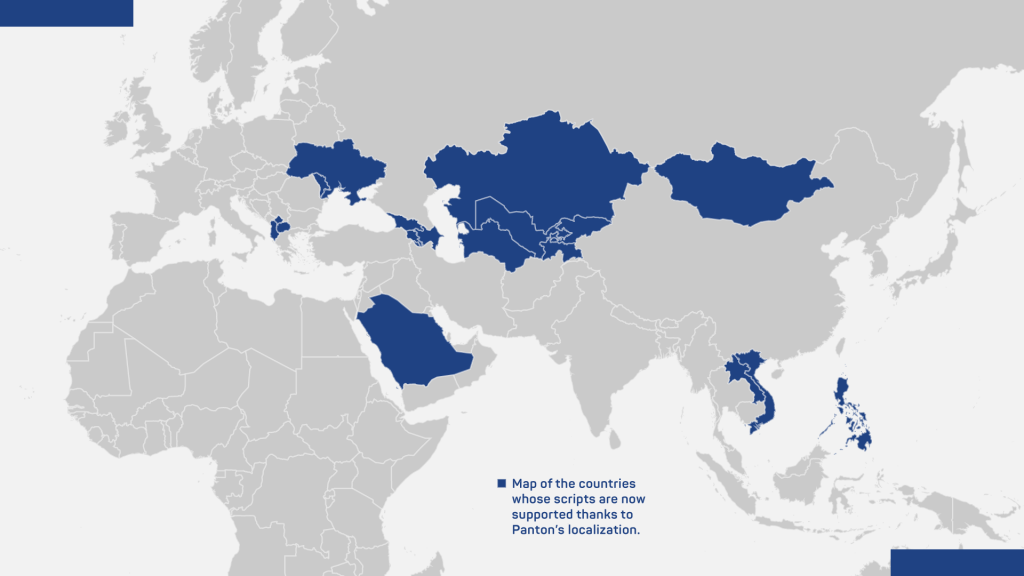
Operating with a vast network of over 60 countries, including the highly developed markets of the United States, Japan, and Korea, Polpharma has developed a strong corporate identity to match their achievements and future business growth milestones.
After the team of Polpharma contacted us organically, it became apparent that the company had already chosen our bestseller Panton Bold, part of the Panton type system, as their corporate typography of choice to complement their business visual language and was now looking towards an extensive localization for their packaging.
One Panton to Match a Rich Linguistic Palette
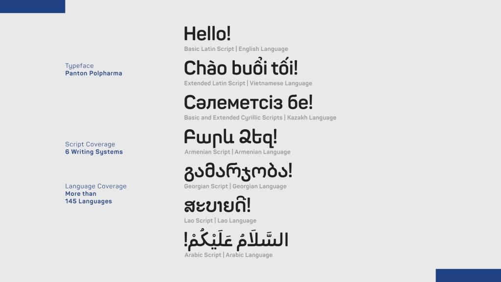
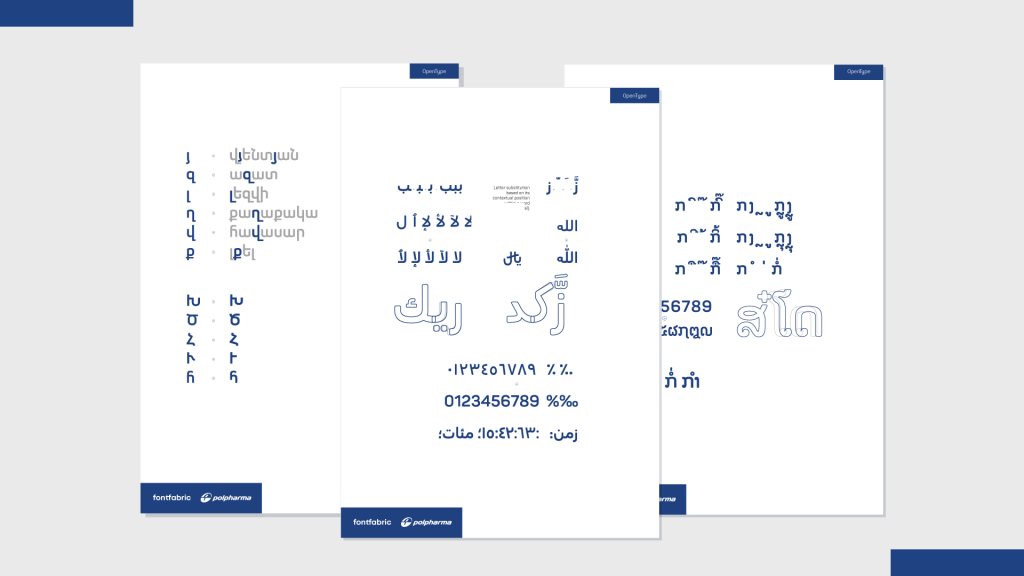
Тhe first step towards successful communication with Polpharma’s multinational audience was to expand the language support of Panton accordingly. This meant including complex languages spoken in countries such as Saudi Arabia, Armenia, Georgia, Kyrgyzstan, Laos, Mongolia, and Vietnam to name a few.
With a clear objective and an indicative scope of the project in mind, the next step was to build a detailed brief — the result of an ongoing consultation process of font customization every partner of ours takes an active part in.
In the discovery phase, our team at Fontfabric with type director Plamen Motev successfully outlined the specific visual expectations for Polpharma’s packaging development and explored the more complex items ahead of time.
Keeping in mind the different scripts and the accompanying technical limitations, a prompt solution was to divide the project into several font files, thus guaranteeing every font’s flawless performance.
You Know a Challenge When You See One — Spelled in 17 Languages
Language support expansion of Panton meant turning the typeface into a multi-script type family, all the while maintaining design consistency. Developing Panton to work with so many languages, without having the linguistic background ourselves, called for the trusted network of typographic professionals from all over the world that we’ve been assembling for the past 12 years.
On a more technical level, the research for all 17 languages included pinpointing the additional letters, punctuation, symbols, and specific software methodology we would need to explore further and implement in the development process later.
The careful analysis of every script and its application to the specific stylistics and design components of Panton was the stepping stone to the shared timeline the project would follow for the next 4 months.
The short deadlines instigated a careful prioritization and thorough planning for the delivery of every script. The whole process was separated into dedicated sprints which allowed us to push forward with other items while waiting for feedback from Polpharma’s team.
As the client was aiming for earlier packaging development for Kazakhstan, Kyrgyzstan, Tajikistan, Ukraine, and Uzbekistan, our initial action plan was to focus on the expansion of the Cyrillic and Latin scripts.
Meanwhile, we utilized all our contacts with international professionals and dove deep into researching the yet unknown scripts.
Steady as We Go
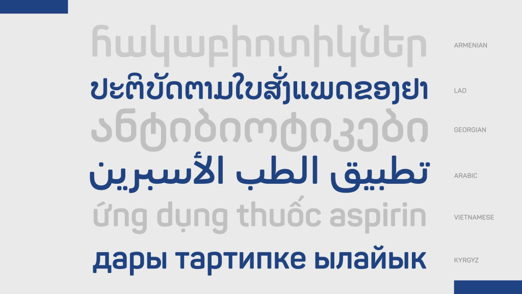
According to the prioritization of deliverables, Polpharma’s team would first set all languages with extended Latin and Cyrillic scripts in Panton’s unmistakable style into production.
Generally, we divided the languages into two categories and proceeded to design the additional letters and diacritical marks accordingly:
- Extended Latin script – Vietnamese, Albanian, Filipino, Moldovan, Azerbaijani
- Extended Cyrillic script – Kazakh, Kyrgyz, Mongolian, Tajik, Ukrainian, Uzbek, Macedonian
The extensions of the scripts and our research on the unfamiliar ones were handled in parallel. We approach all new languages and unique scripts with great curiosity. Uncovering alphabets, studying the vowels and consonants, as well as the accompanying punctuation and numerals is a meticulous process, which we cover from start to finish.
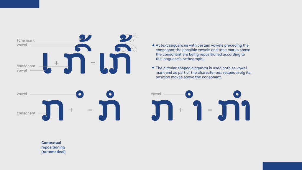
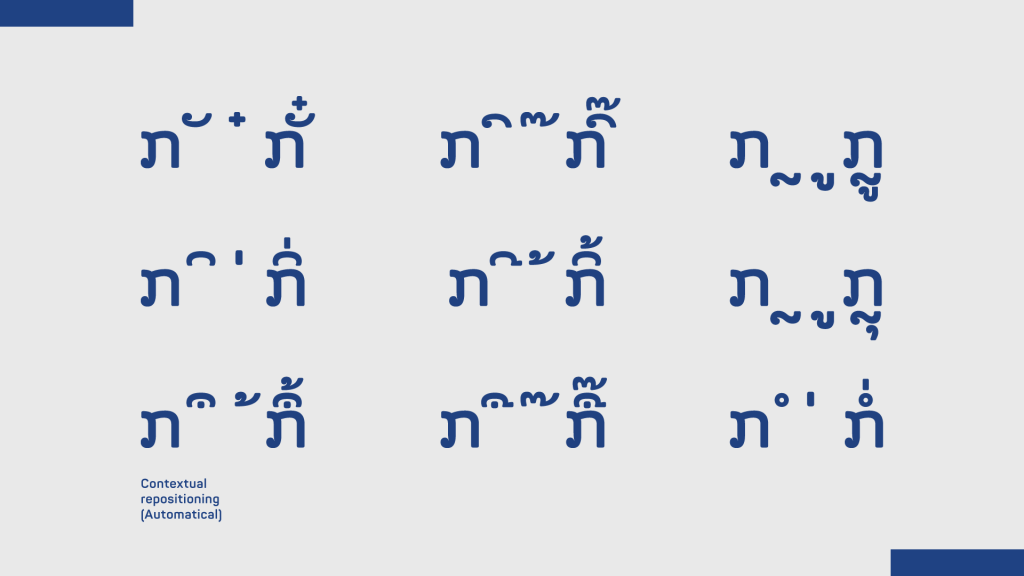
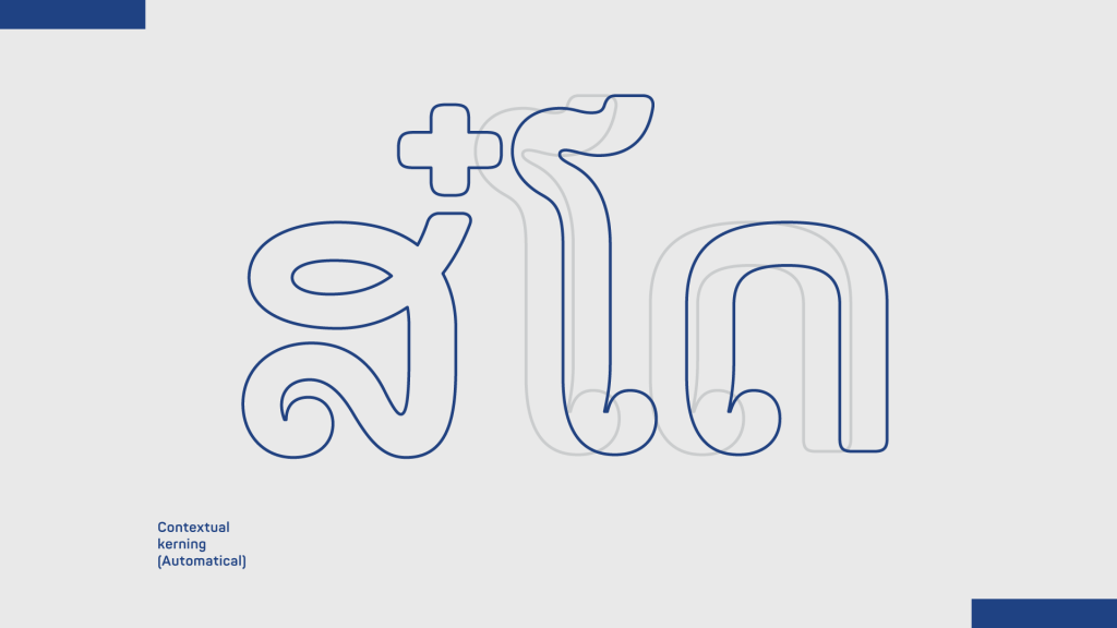
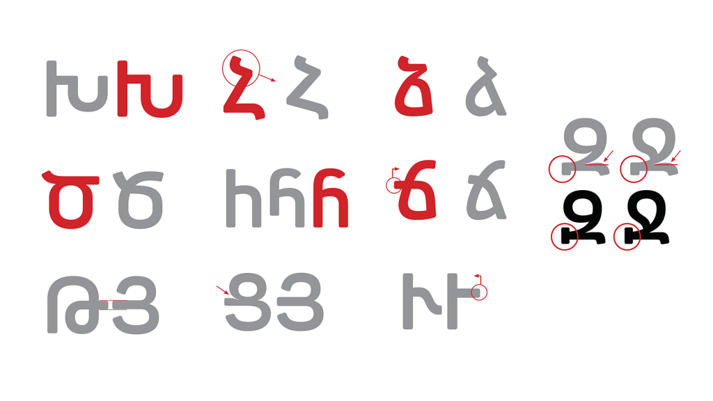
Several scripts proved to be worthy challengers to our collective design efforts and stood out in the whole project – Lao, Armenian, Arabic, Georgian and Vietnamese.
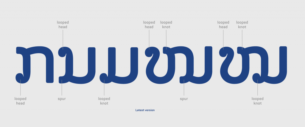
Lao script
As a starting point, we studied the writing script which included thorough decryption of Lao characters and phonetics. The scarcity of resources on Lao typefaces led to the research of the neighboring Thai script, which has a very similar writing system.
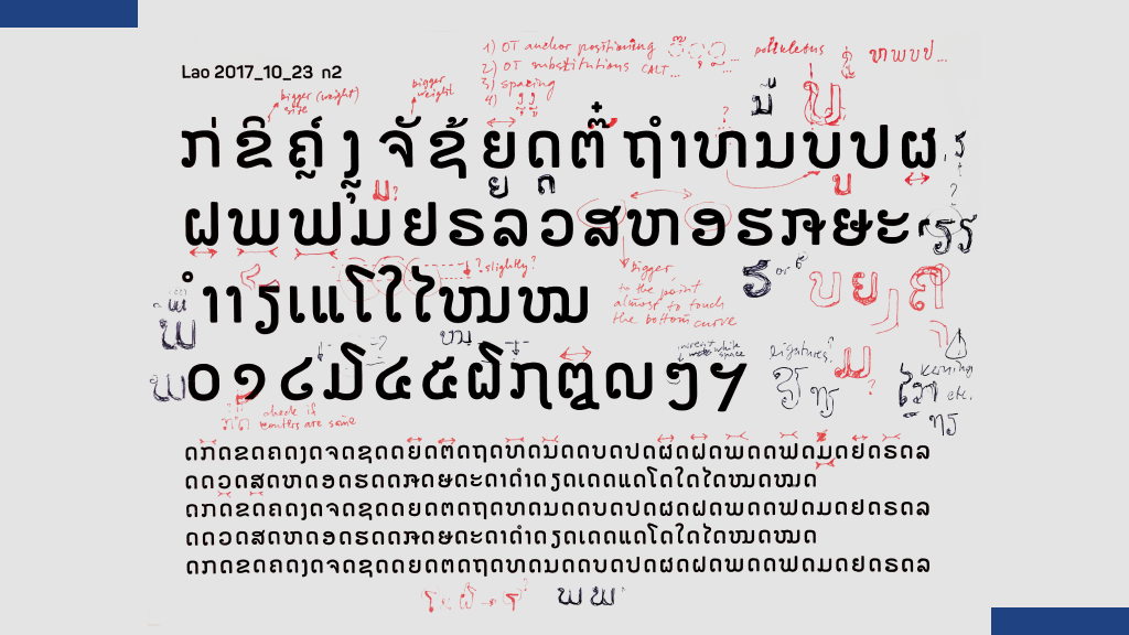
With a richer resource pool as a strong base, the next step was to gather advice and feedback from trusted design experts and native non-professionals.
Key guidance came from Ben Mitchell – a devoted expert in South East Asian scripts, who the main designer working on the script, Nikolay Petroussenko, approached. He helped with additional lettering examples, design expertise, and OpenType technology that were to be tested on the web, as the widespread design software didn’t provide language support for Lao back then.
Nikolay Petroussenko recalls:
“I wanted to keep track of the typeface’s approval by native non-experts, so I searched for Lao community groups on Facebook where I posted my sketches for feedback. This is crucial to keep the legibility of the typeface for non-native scripts and lead me to important decisions, such as to keep loops in the characters and find a way to make it consistent with the existing Panton Latin and Cyrillic.”
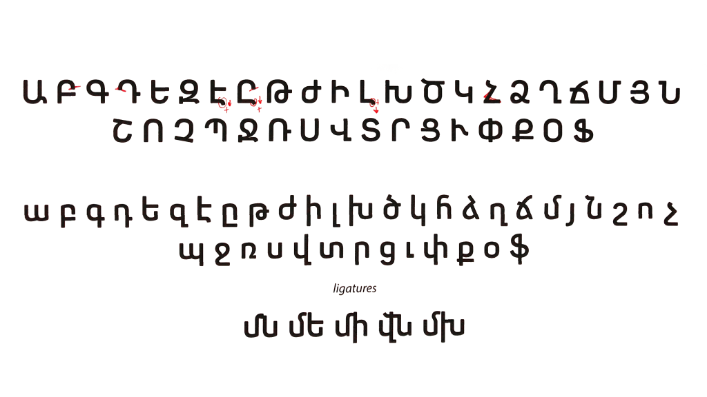
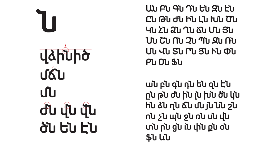
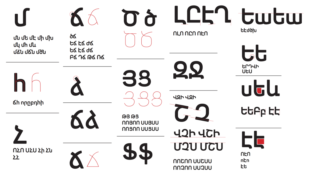
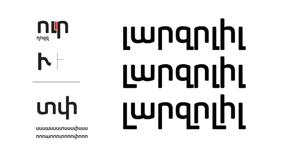
Armenian script
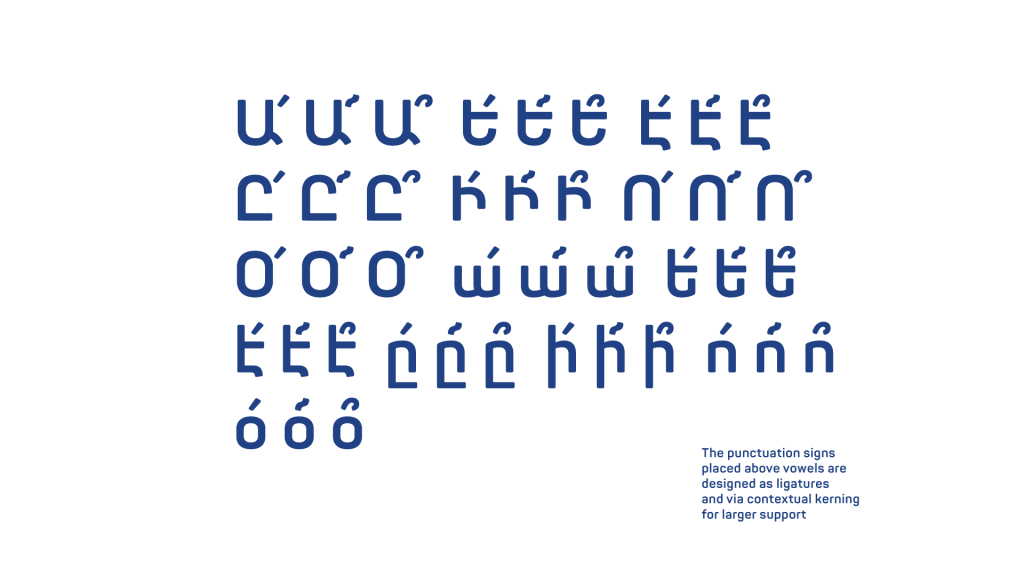
We continued with a thorough exploration of the Armenian script relying on Jasmine Dum-Tragut’s “Modern Eastern Armenian” and general information on the current official language in Armenia – the Eastern Armenian. The script stood out with its unique punctuation marks, which are incorporated above specific letters in the Armenian words.
Plamen Motev shares:
“The Armenian script is extremely beautiful and interesting. A well-designed Armenian typeface should be applicable in text fields without compromising its rhythm. As a solution, I developed a number of ligatures and contextual ligatures to ensure the flawless interaction between all descending characters, without running into issues like overlaps or large gaps between them.”
The biggest challenge was to carefully decide on the technical aspects of the typeface’s development, as a great number of non-typographical professionals would use Panton in a variety of software.
Throughout the whole process, all technical and design solutions were debated and validated by various professionals, with the esteemed Armenian type designer Gor Jihanian as the main contributor.
Arabic script
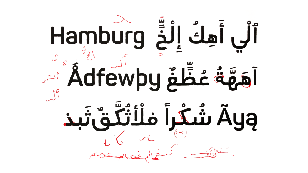
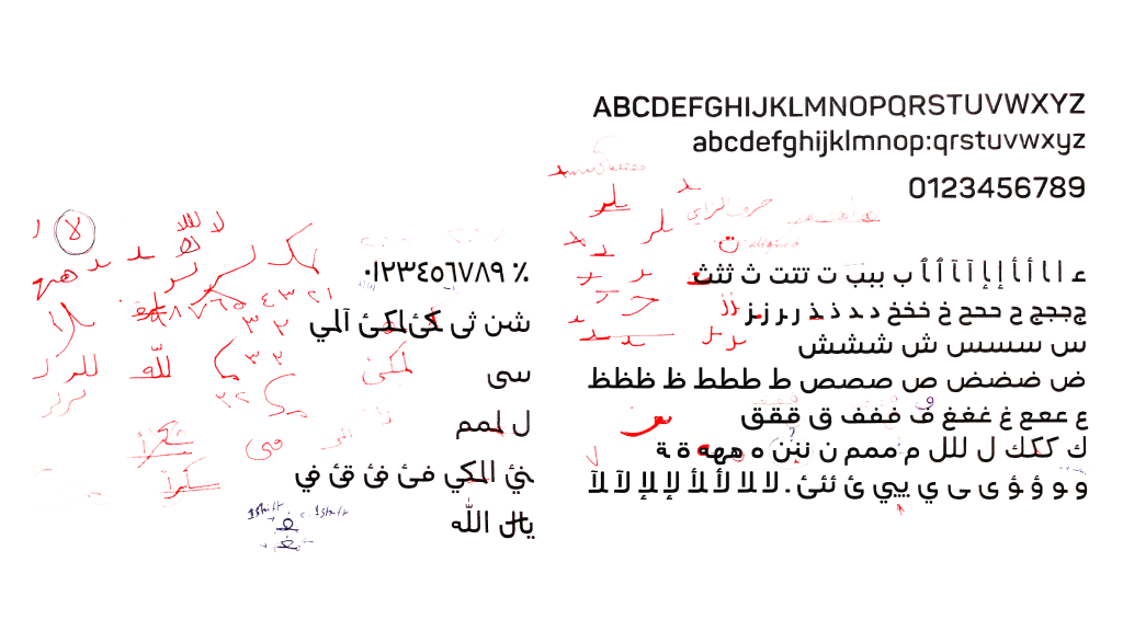
With a rich background in exploring the Arabic type design realm side by side with linguistic experts and designers, Fontfabric designer Nikolay Petroussenko was a natural fit.
Panton Arabic’s development proved to be a challenge on its own, as the successful mix-and-match of the inherent Arabic characteristics and the stylistic consistency of the sans serif typeface Panton was a complex task. But not impossible!
To help exceed all expectations, our team relied on the consultations from Jawaher Alali, a MATD Reading alumni, and several other experts, such as Lara Captan and Borna Izadpanah.
Georgian script
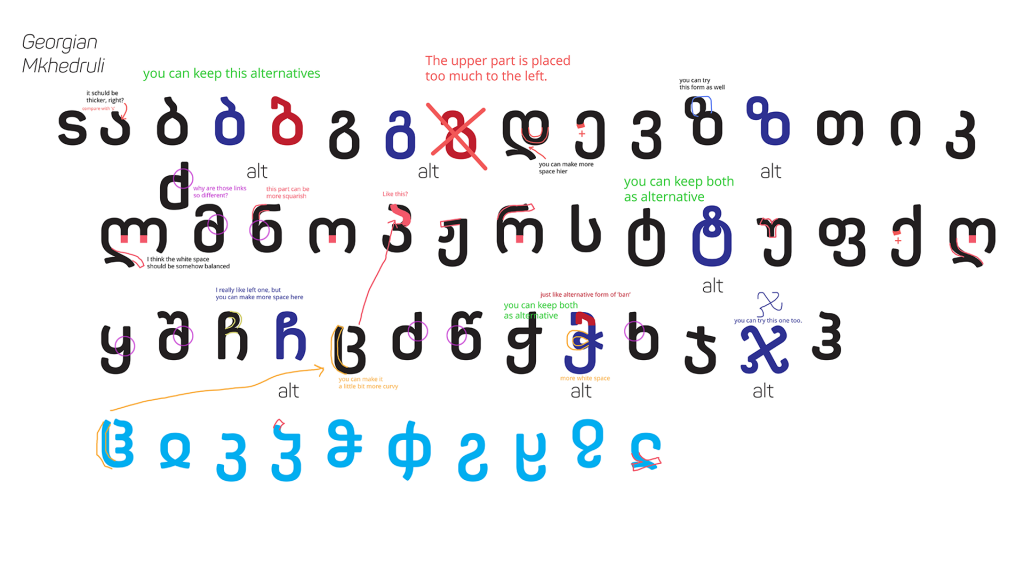
Another unfamiliar typоgraphic territory was the distinctive Georgian language.
With the substantial help of Akaki Razmadze – an expert in Georgian type design and one of the most active authors on the topic – Plamen Motev was able to explore the history and legacy of the Georgian script in depth.
The rich variation of the Georgian language from the past eleven decades has left the modern script without capital letters. These are included as a togglable feature for the users of Panton Georgian, called Mtavruli letters.
Nowadays, thanks to Akaki Razmadze and like-minded people, the capital letters may be included as Unicode characters, as approved by the Unicode Consortium.
Vietnamese script
Although Vietnamese is based on the Latin script, there were particular clusters of diacritical marks that we explored further and incorporated into the Panton typeface.
As the Vietnamese language presents itself with four kinds of tones, which in combination with diacritics create marks on top of other marks, the entire typeface’s vertical metrics were influenced.
This called for the independent design of Panton Vietnamese. Additional information and resources were provided by the acclaimed Donny Trương, a director of design and web services at George Mason University Antonin Scalia Law School.
The outcome – achievements and statistics
The result of our partnership with Polpharma, is by far, one of the most valuable and rewarding projects our team at Fontfabric has achieved.
The complex expansion of our bestseller Panton not only met Polpharma’s expectations and production goals but also enriched our typographic expertise in unique scripts from all around the world.
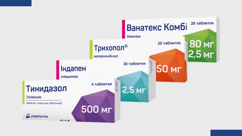
After a rapid delivery of all extended and newly designed scripts, Polpharma successfully entered international markets with localized packaging for all their life-saving solutions.

Browse all Fontfabric font case studies.
Are you looking for a custom typeface?
Drop us a line at contact@fontfabric.com
